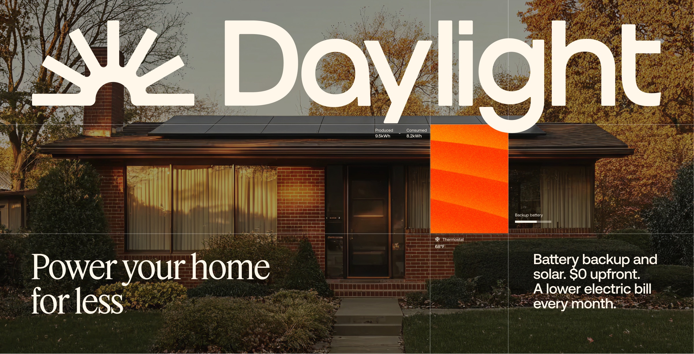
This is
Daylight
A new kind of
energy company
01 — Logo
Logo
Use the full logo wherever space allows. The logotype works in tight horizontal layouts. The icon works at any scale, from a brand signature to a compositional element. Both the icon and logotype can be split and placed independently within a layout.
Logo Lockups
Use the full logo wherever space allows. The logotype works in tight horizontal layouts. The icon works at any scale, from a brand signature to a compositional element. Both the icon and logotype can be split and placed independently within a layout.
Full Logo
Logotype
Icon
App Icon
Favicon

Logo Variants
Black on white and white on black are the defaults. White on orange is approved for high-visibility brand moments. Beige is for photography where white reads too bright. Secondary and technical variants are below. Avoid using an orange-colored logo. Exceptions require brand team approval.
Primary
Standard use across all brand touchpoints
Secondary
Creative contexts only — marketing collateral, banners
Technical
Documentation sites and technical contexts only
Logo Misuse
The most common mistakes. Distortion, effects, unapproved colors, and rotation all weaken the mark. When in doubt, use the original source files.
Don't stretch or skew
Don't add effects or shadows
Don't use unapproved colors
Don't rotate or tilt
In the wild
02 — Color
Palette
The Daylight palette is derived from the visible spectrum of sunlight. From orange to purple to deep blue, every color traces back to what the sun puts into the sky. Orange is the primary brand color. Beige is the primary surface.
Primary
Daylight Orange
Daylight Beige
Daylight Beige 1.0
Daylight Beige 2.0
Daylight Dark Beige
Black
Grey
White
Secondary
Yellow
#FCCC3C
Brown
#4C2806
Purple
#C8B0FF
Dark Purple
#321F61
Light Blue
#BED5FF
Dark Blue
#1D3E86
Gradient system — animated visual motif
Use as background or frame element with photography. Never over the logo.
Yellow — Secondary
Purple — Secondary
Blue — Secondary
In the wild
03 — Typography
Typography
Three typefaces working in concert, each with a fixed role. Misuse dilutes the brand.
01 — Display
Feature Deck
Reserved for hero and section headlines, and rarely more than two instances per page. It carries the brand weight.
02 — Body / UI
Aeonik Pro
Titles, buttons, body copy, and subtitles. Medium for titles, buttons, and large supporting statements. Regular for everything else.
03 — Mono / Labels
ABC Social Mono
Eyebrows, data, and captions. Always uppercase, always tracked. 12px or 16px only. Never for body copy.
Type Scale
Hero / Display
Section Heading
Title
The sun belongs to all of us
Body / Subtitles
Daylight designs, installs, and manages complete home energy systems: solar, battery storage, and the software that ties it all together. One company, one experience, one monthly cost that's lower than what you're paying now.
Labels / Mono / Data
[ Sunnyside Ambassador ] · Install Complete · 2,400 kWh · Jan 2025
In the wild
04 — Voice & Tone
Tone of voice
Daylight speaks with confidence and precision. Every word should earn its place. Be specific and grounded. Write to be understood.
More Power
The tagline. Two words that carry our mission forward.
Power on
A sign-off and a push forward. Used to close campaign moments.
Power your home for less
The homeowner pitch. Five words, one clear promise.
Terawatts
For the big picture thinkers.
gday
If you know, you know. Say it back.
We get to the point. Short sentences, plain language, no jargon. If a word doesn't help the reader, it goes.
We believe solar is the future and we have the numbers to prove it. Our optimism is earned.
We write the way people talk. Conversational, approachable, and always respectful of the reader's time.
We know the product. We know the numbers. The copy sounds like it. Real savings, real technology, real results.
In the wild
05 — Photography
Photography
Five categories of imagery. Each one captures a different side of the Daylight experience.
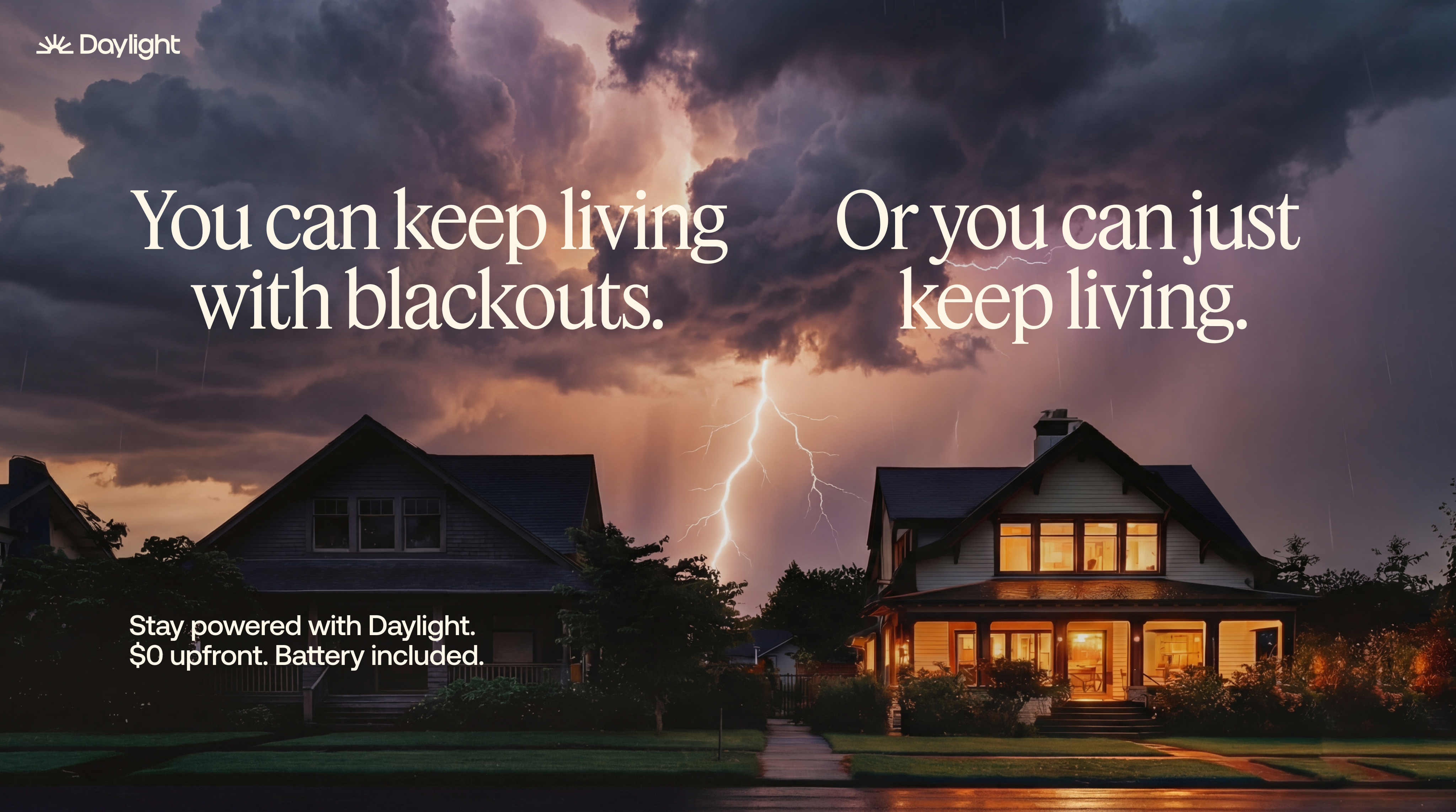
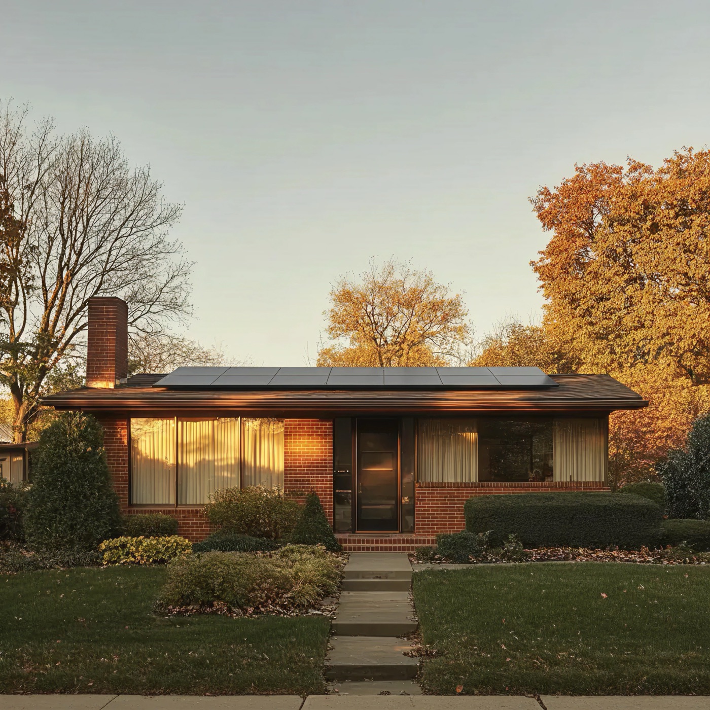
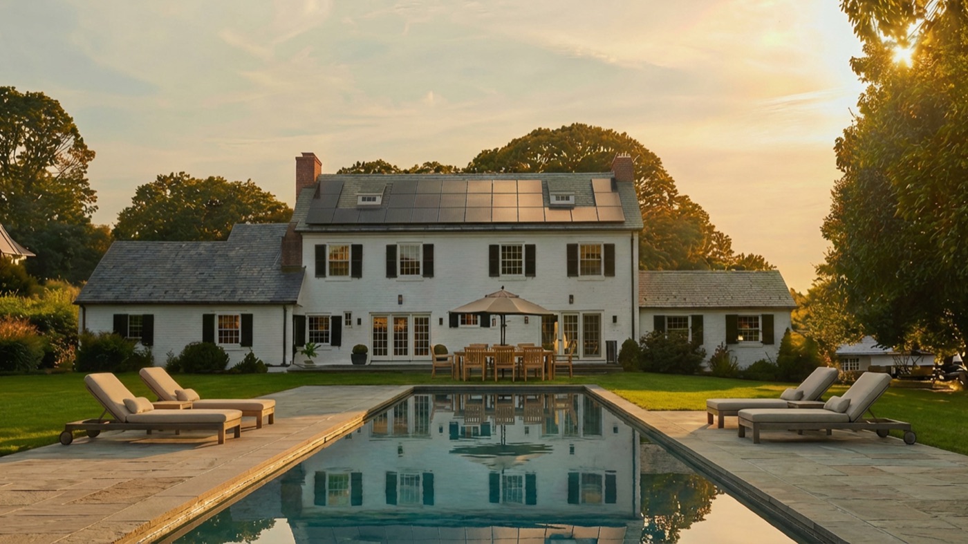
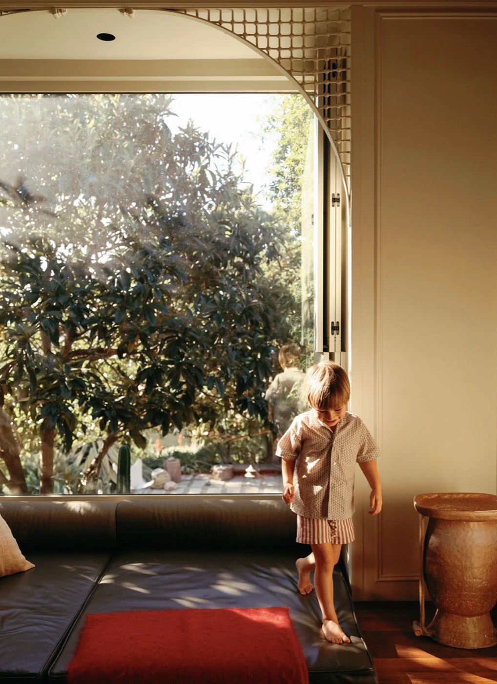
Architectural Homes
Stylish, attainable homes that feel real and lived-in. Warm, natural light. Diverse American styles from modern suburban to updated craftsman, photographed with editorial clarity and a touch of golden hour warmth. Solar panels are typically shown in the backyard.
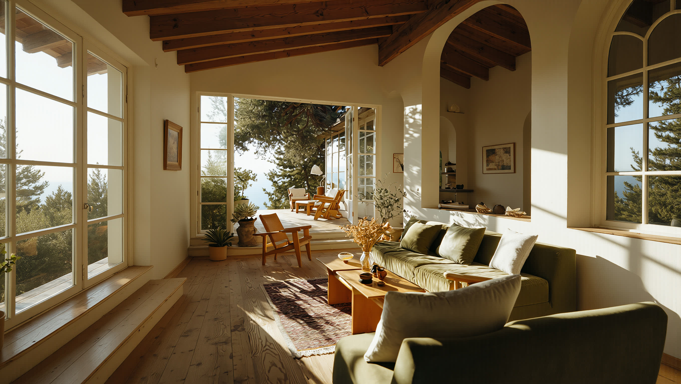
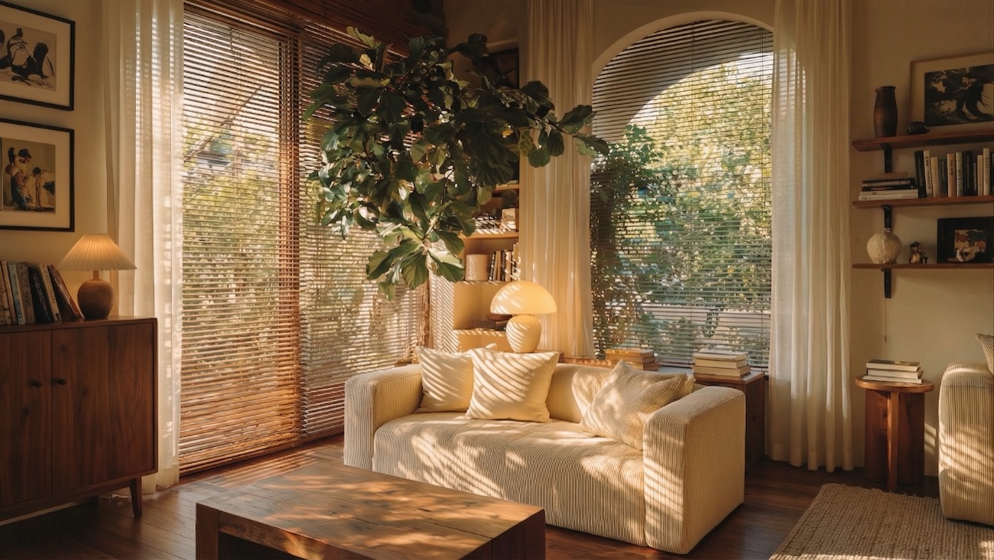
Home Interiors
Natural interiors where sunlight pours through windows. Soft and warm. Movement and light shifting across walls are key.
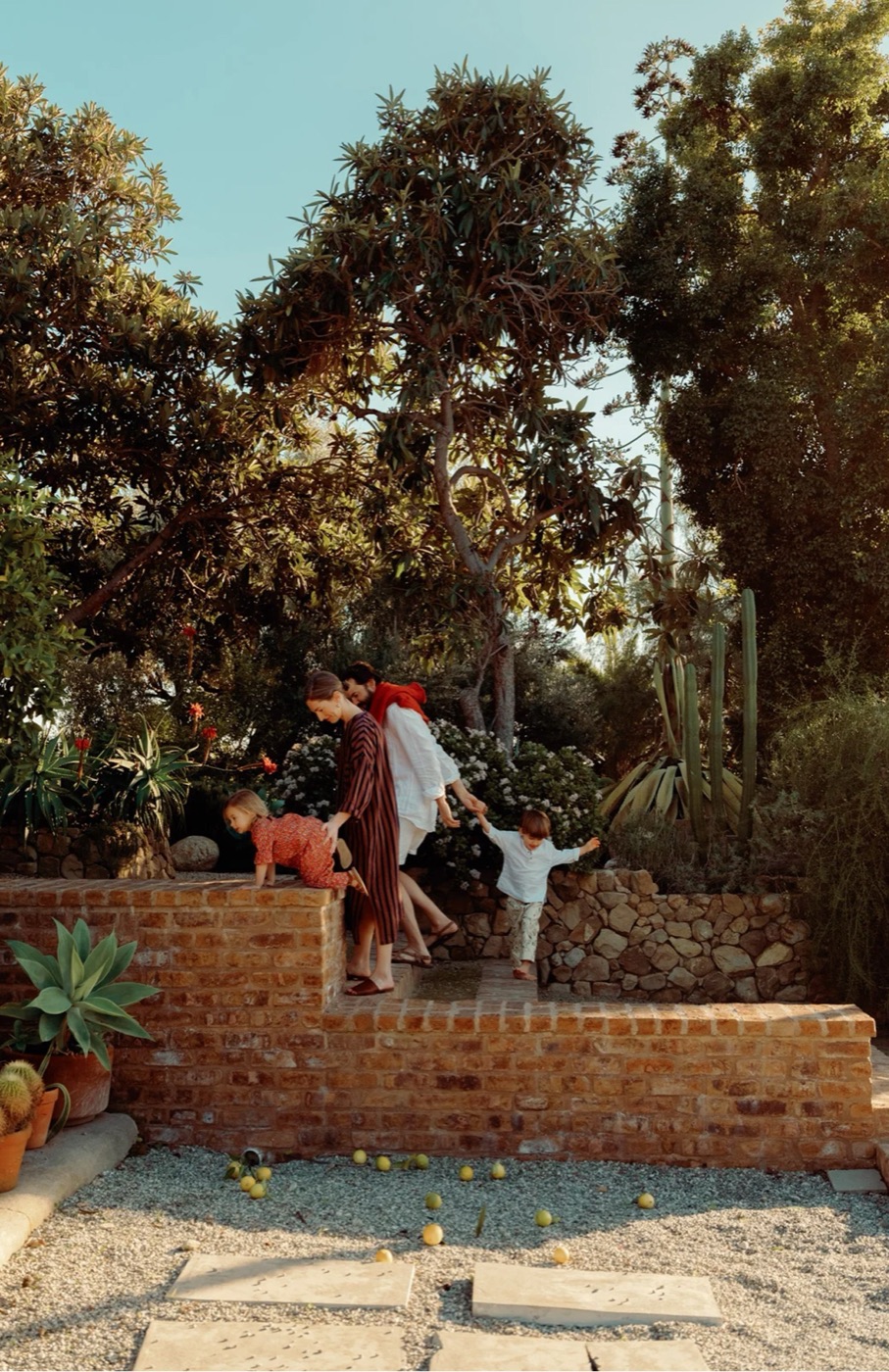
Lifestyle & Family
Captured moments of connection and comfort. Family life and personal rituals, never posed. Every shot should feel real.
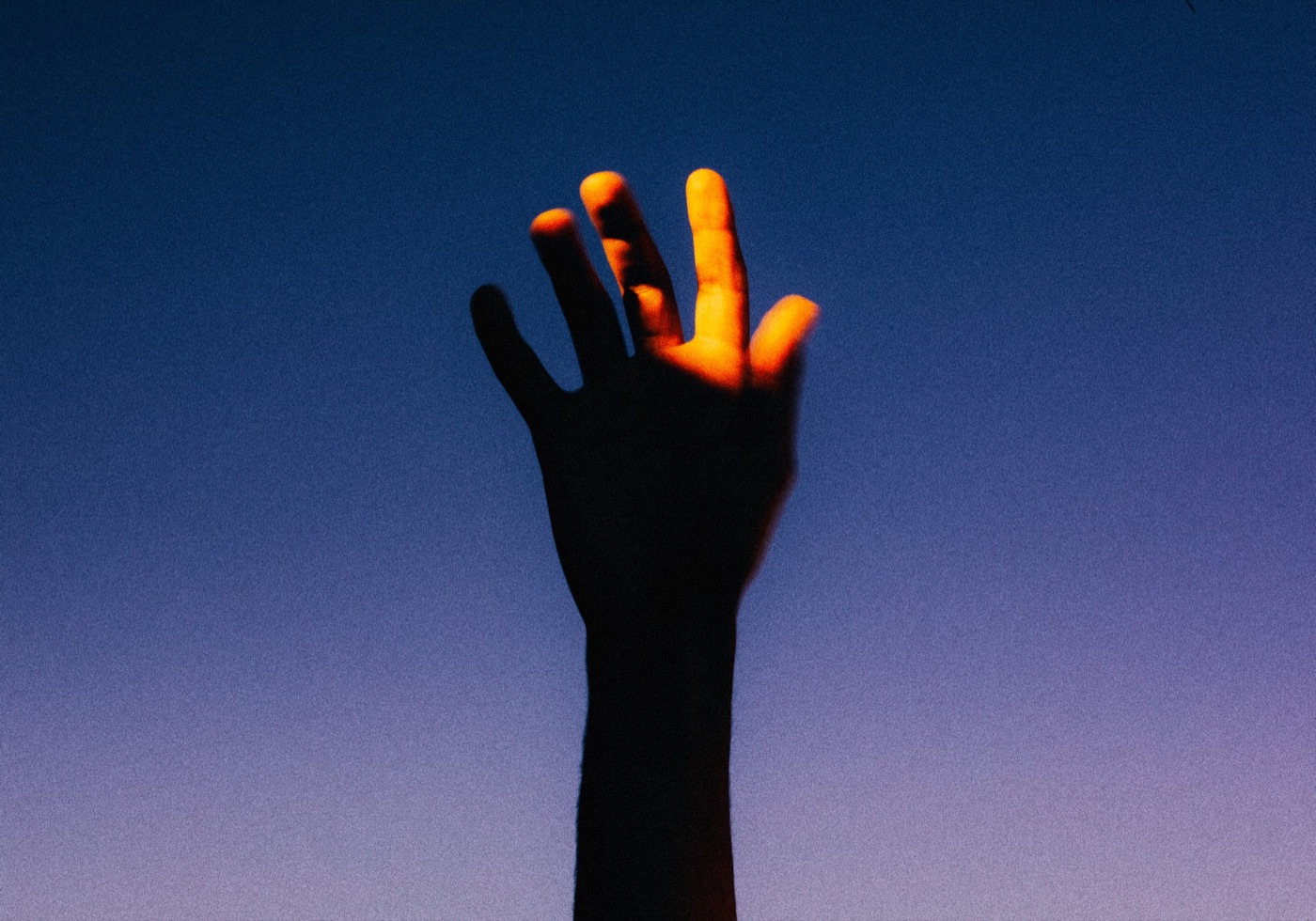
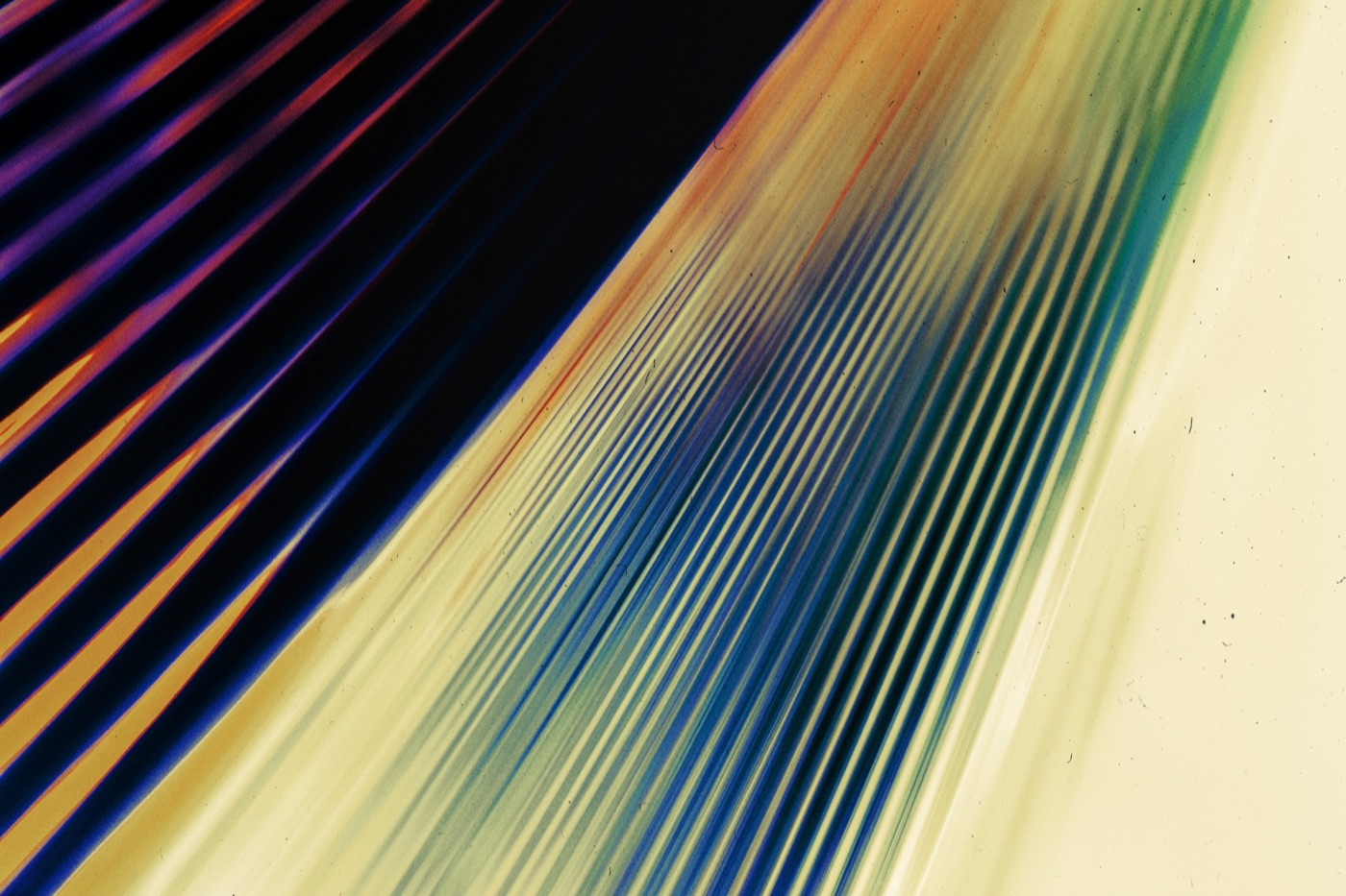
Aesthetic
Conceptual, design-forward imagery that evokes light as power. Light flares, lens grain, soft contrast, slightly vintage or analog texture. Never literal.
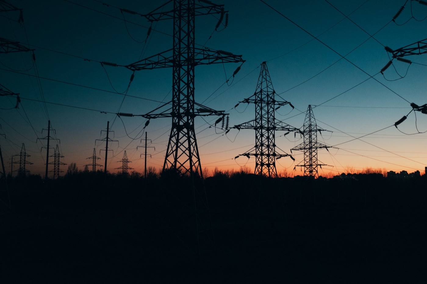
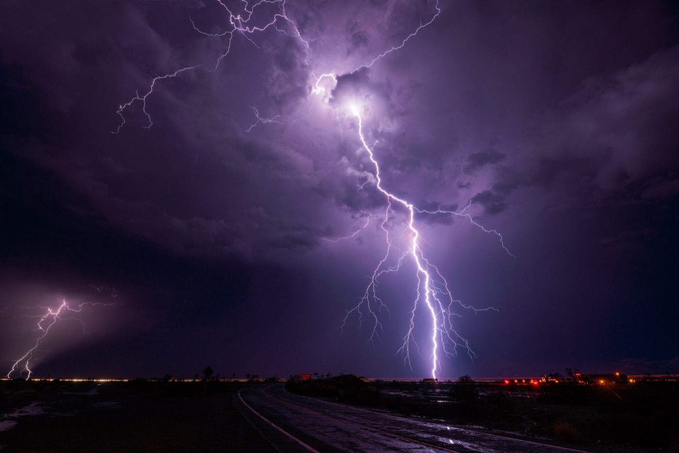
Elemental
Energy as a force of nature, photographed at scale. Transmission towers at dusk, lightning across open plains. Raw and indifferent to human scale. Use sparingly.
In the wild
06 — Motion
Motion system
The animated gradient is Daylight's visual expression of energy in motion. The way it shifts and settles mirrors the energy moving through the network.
Motion direction
The animated gradient is a core element of Daylight's visual system. It works as a background or frame element within the grid layout, scaled or tilted, and sits exclusively on top of images or videos. Data and graphic elements can surround it, but only when the gradient is full-screen or serves as the focal point of a section. Always use it consistently.
Motion gradient
When the gradient runs full-bleed, it holds the frame. Type, data, and brand elements layer over it. This is reserved for hero moments and campaign surfaces where motion is the centerpiece.
07 — Components
User Interface
Terminal
Direction 01
Warm Light
Matches primary brand palette. Editorial, clean, sits naturally in the brand kit.
Direction 02
Glassmorphic
Layered and modern. Sits over photography or gradients — strong for hero use.
Design Tokens
Quick reference
Copy-paste CSS variables for engineers and AI agents implementing Daylight interfaces. These tokens are the canonical source of truth.